
RHETORICAL ANALYSIS | DESIGN ANALYSIS |
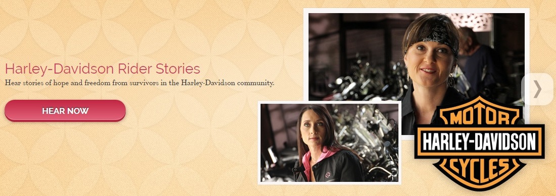
 Audience - Everybody The National Breast Cancer Foundation (NBCF - link here) seeks to “provide help and inspire hope” to everyone affected by breast cancer, from survivors to family members. It is designed specifically for women between the ages of 25-50, but is accessible for people of all ages, races, and genders. Purpose - Knowledge is Power Education is the primary focus of the website, stressing the importance of early detection and a healthy lifestyle. There are descriptions of the various diagnosis methods available, and explanations of the different stages of breast cancer. There is support to those who have been diagnosed and their family members, and descriptions of volunteer and donation opportunities for people who want to help those affected.  Context - Sharing (through technology) is Caring Using a website is an effective method of disseminating information, since it is easily accessible by many people. NBCF also incorporates social media programs such as Facebook, Twitter, Pinterest, etc., along with apps for the iPhone and iPad for easy sharing, so the message can reach even more people. The interactivity of the website makes it more engaging than a print brochure would be, and allows for links to other sources, including other businesses that sponsor NBCF. These links give people an opportunity to patronize the businesses who support a common cause.  Author - Probably a Team of Women The website author in general is NBCF, although there is probably a team that created the website and not just one person. Given the color scheme and content, the authors were most likely women. Genre - Surprise, it’s a Website This website can be categorized as an informational website, specifically under women’s medical health. | 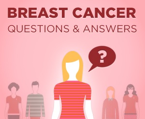 Emphasis, Contrast, and Alignment - Inform and Inspire The organization’s name is prominent on the page, as are images of women of all ages. The colors are soft, muted, and feminine, which allows the color pink, the signature color of breast cancer, to stand out. Most of the elements of the website are centered, but the text is small and either left or right aligned, opposite the large images. This highlights the human and emotional aspect of breast cancer, as opposed to being overly clinical. However, it doesn’t go overboard on the emotional aspect to the point of being melodramatic. It even includes stories from “Harley Riders,” to convey strength. The idea is that being diagnosed doesn’t mean despair and defeat - instead the disease is manageable with knowledge and support.  Organization and Proximity - Easy Navigation The website is organized into categories: about breast cancer itself, about the organization, about the organization’s programs, and ways to help. These are listed across the top of the page, and there are several subcategories under the main ones, to further narrow the search. These divisions allow the user to easily to navigate to what is most important to them, without overwhelming them with too much information. Each category is spaced far apart, so that each gets equal importance. The use of large spaces continues as the user scrolls downward, alternating between white space and pink, and between topics saying as medical information, ways to donate, and staying informed. |

All images from the NBCF website.
