How Do I Want To Represent Me?
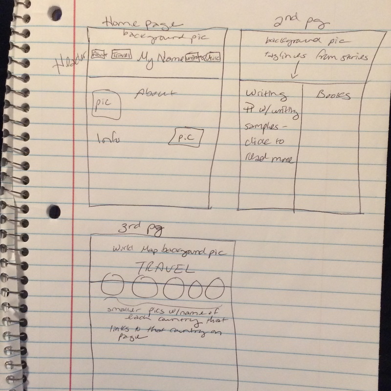
My personal website reflects the things that are important to me, including family, friends, reading and writing, and travel. I created the website using the template from the HTML Tutorial from class, and by asking questions of a couple of classmates and the professor. I was able to add background pictures because of a classmate’s help. I also used the resources available on the class website such as the W3 Color Picker and Creative Commons photo search.
This Is Confusing...
I have never had any experience with HTML code before, so just understanding some of the terminology was a struggle. The CSS Properties link helped a lot with understanding how to make style adjustments to the website. Once I started to get used to the way the code was formatted, things got easier. I just had to remind myself that some of the code was on the HTML index and some of it was on the CSS style sheet. Sometimes my problems were solved simply by adding a semicolon, quotation marks, or other minor formatting element that I had forgotten. Other items weren’t so easy to fix, including things that needed javascript to run, so in the end my website is more simplistic than I was initially planning on. If I knew more about the code, I would arrange some of my pictures in a more artful way, including overlapping some of them for interest. The header would be more complex, possibly with a picture behind my name. I might also try to include some sort of animation. Essentially I would like it to look less simplistic, although I am pleased that I was able to do as much as I did, given that it was my first attempt. I keep comparing it to the Weebly templates I’ve used in the past and wishing it looked a little more professional and streamlined like they do.
Give Me Strength
The biggest strategy I used when completing the website was PATIENCE. Creating the website was time-consuming, and accepting that there would be limitations, and some trial and error attempts, helped me to keep moving forward. When things didn’t go as planned it was frustrating, but when I tried something new and it worked, it was very rewarding!
Design Dilemmas
I thought a lot about spacing and proximity in the design, trying to keep the website from looking too cluttered, and yet trying to make it look as sophisticated as I could. I used a lot of pictures for visual interest, and headers to give a quick overview of my main points. I relied heavily on visual and linguistic modes, mostly because they were the easiest to code. Color and contrast were very important because of my limited knowledge, and hopefully showcase the content in a pleasing way.
I Meant To Do That
I believe that anyone looking at my website will think that I am “old school” since I don’t have all the bells and whistles of a normal website, especially since I’m lacking social media icons. I tried to play into this to make it look intentional by using an old style font for the headers, and old-style pictures such as the fountain pen and mahogany library.